Designer specializing in functional digital experiences.
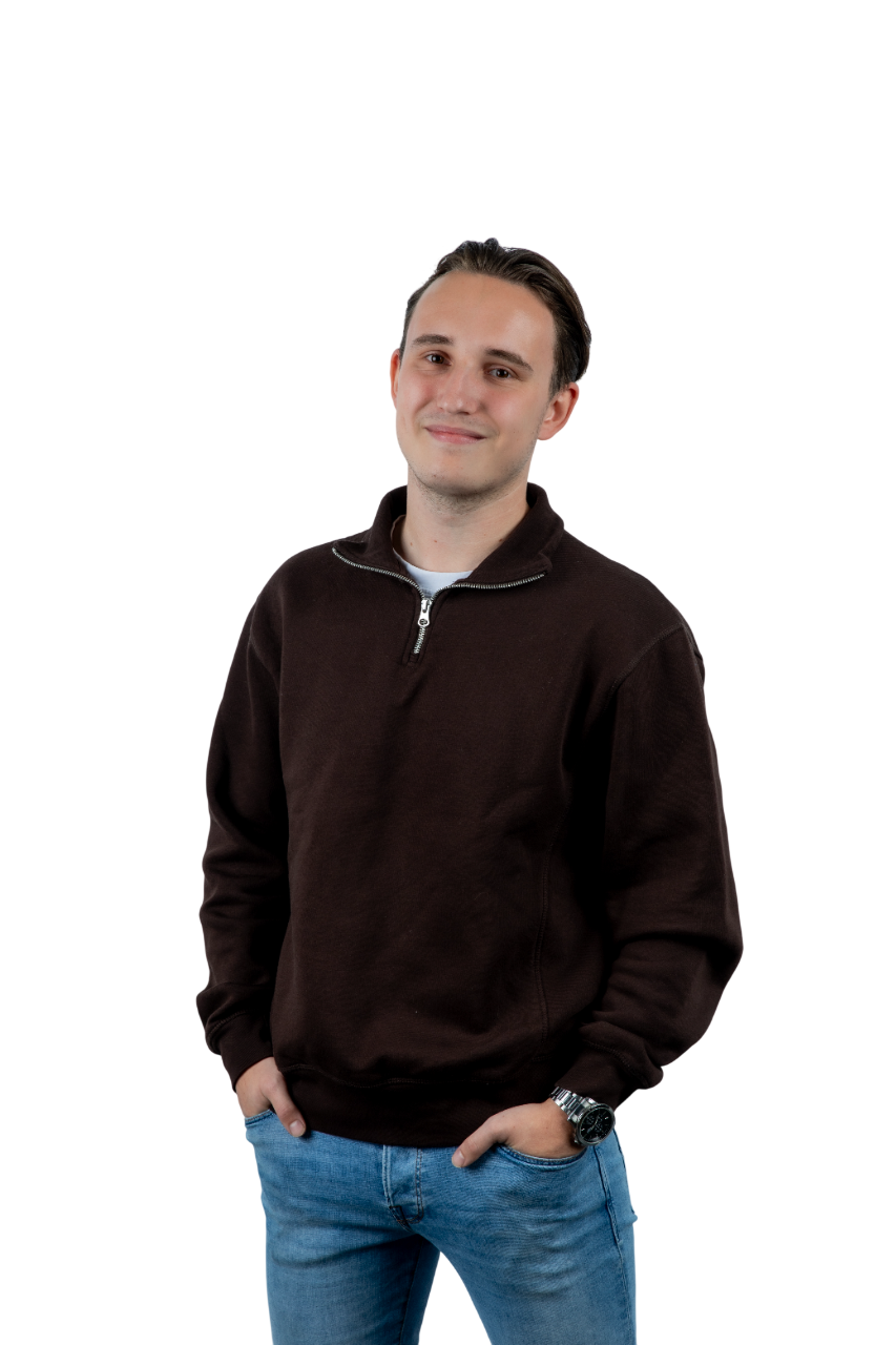
Hi, I am Bas Geven, a 23 year old student. I am also a multidisciplinary designer focused on creating sharp, impactful visual identities and digital products. My work is characterized by a minimalist aesthetic and a deep understanding of user-centered design principles.
I transform complex ideas into clear, user-friendly interfaces. I believe that design is not just about how it looks, but also about how it functions as a tool for communication and growth.
EXPERTISE
UI DESIGN
UX RESEARCH
BRAND IDENTITY
DESIGN SYSTEMS
FRONT-END DEV
TOOLS
FIGMAADOBE XDILLUSTRATORPHOTOSHOPVS CODEGITHUB
CURRENT LOCATION
Eindhoven, NL
LET'S CONNECT
Have a specific project in mind or just want to say hi? I'm always open to discussing new opportunities and creative collaborations.
Helping teenagers get their driver's license faster and with less stress, by redesigning CBR's role as a digital companion.
ROLE
UI/UX Designer
TYPE
Student Project
YEAR
2024
DURATION
10 weeks
THE PROBLEM
CBR (Centraal Bureau Rijvaardigheidsbewijzen) is the national organization responsible for driving licenses in the Netherlands. Despite their central role, pass rates among teenagers remain low. Through my research I discovered that the main causes are stress during the exam, poor preparation, and a lack of guidance throughout the process. CBR was seen as just an exam organization, not a companion on the road.
THE CHALLENGE
How can CBR effectively guide teens and their parents through the process of obtaining a driver's license, reducing failure rates and promoting safer driving habits?
RESEARCH
I started by researching why teenagers fail their driving test. The biggest finding was stress, even well-prepared students make unexpected mistakes under exam pressure. Other key factors I identified were poor viewing behavior, insufficient traffic insight, driving too slowly, and lack of steering control.
I also looked into CBR's current role, which turned out to be minimal, they only organize the theory and practical exam. This gave me a clear opportunity to design something that expands that role digitally.
IDEATION
After gathering my research findings, I mapped out my main question on a whiteboard: How to help teenagers with driving anxiety. I brainstormed different solutions and quickly concluded that an app was the best format, it allowed me to address multiple pain points in one place and reach teens where they already are.
THE SOLUTION
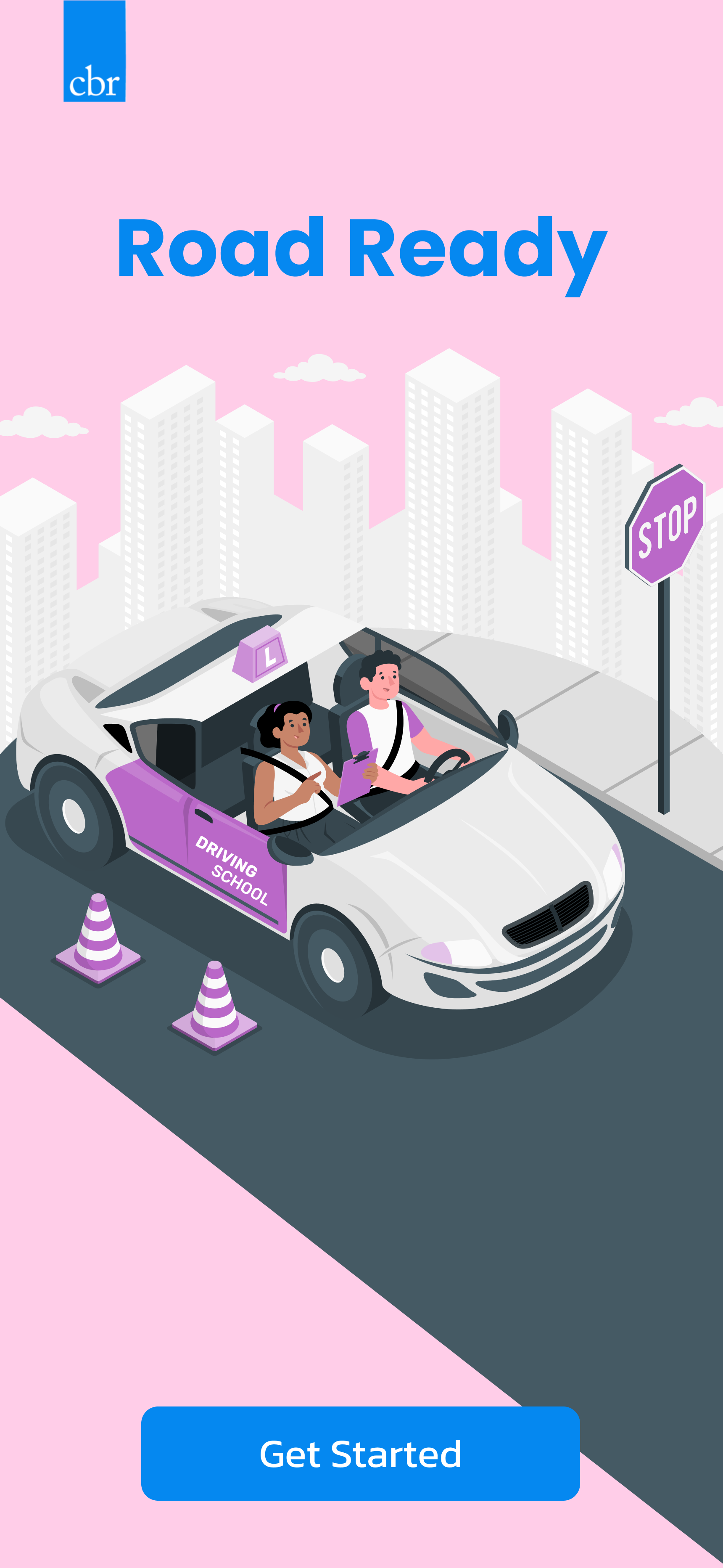
I designed a CBR companion app called Road Ready that supports teenagers throughout their entire driving license journey. The app includes personalized theory practice that adapts to weak spots, lesson feedback tools for both student and instructor, stress reduction tips and exam preparation guides, and a clear overview of progress and next steps.
My goal was to make CBR feel less like an exam body and more like a trusted guide, always there to help teens succeed.
Designing a loyalty program to improve after-sales and increase customer retention for TORQ Benelux.
ROLE
UI/UX Designer
TYPE
Student Project
YEAR
2025
FOCUS
Loyalty Program
THE ASSIGNMENT
The goal of this project was to improve the after-sales phase of TORQ Benelux and increase customer loyalty and repeat purchases. Research from a previous student showed that customers are satisfied with products, the ordering process and delivery, but that there is little follow-up after a purchase.
Three key improvement areas were identified: developing a loyalty program to reward returning customers, creating more personal contact moments through automation, and improving the website experience to make reordering easier. My focus was on designing and developing the loyalty program.
THE PROCESS
I started by mapping out the action points for the loyalty program: define a simple basic structure with suitable rewards, establish how customers participate and how it is tracked, and communicate the program clearly to customers.
I then developed three different concepts for the loyalty program, which I discussed with the project team and the client. Based on that feedback, two concepts were selected for further development.
I tested both concepts with TORQ's target audience. The results were clear: Program A was the strongest concept.
THE SOLUTION
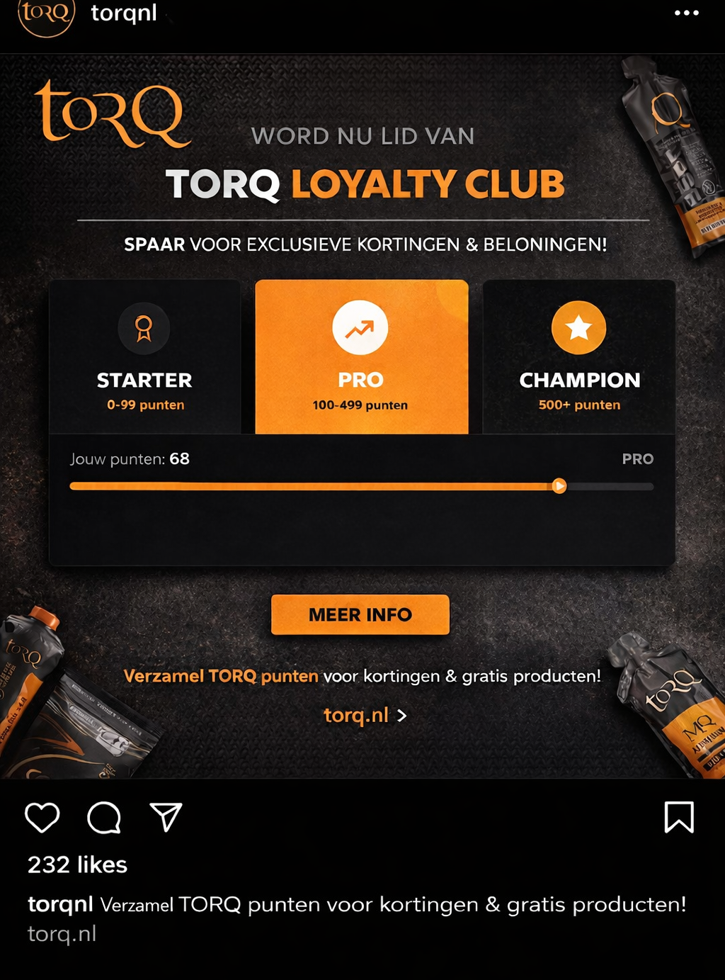
Program A is a points-based loyalty system with three levels:
Starter (0–99 points): New customers start here and earn points with every purchase. For example: €1 spent = 5 points, a review with photo = 35 points.
Pro (100–499 points) : Regular customers who engage with the brand through repeat purchases and reviews.
Champion (500+ points) : Loyal customers who receive the best rewards including discounts and free samples.
Extra motivation comes from earning points for reviews and social media actions, keeping customers more engaged with the brand beyond just purchasing.
DESIGN
When designing the loyalty program, I took the TORQ brand guide into account and applied techniques from choice architecture to ensure the design guides user decisions and is easy to understand. User testing confirmed that the program was clear to new users, most participants quickly understood how it works and what the benefits are. The combination of visible progress, clear actions and organized levels motivates users to stay active.
As a final step, I also created a social media post to show how TORQ could promote the program to their customers. All findings, the design and promotional ideas were presented to the stakeholder.
SOCIAL MEDIA PROMOTION
To show how TORQ could promote the loyalty program to their customers, I designed a social media post that captures the energy of the brand and clearly communicates the benefits of joining.
Creating a sub-brand and campaign for a new festival drink — targeting Gen Z with a fresh take on an unexpected ingredient.
ROLE
UI/UX Designer
TYPE
Student Project
YEAR
2025
METHOD
Design Thinking
THE ASSIGNMENT
For this project I had to create a sub-brand and campaign for a new drink. The goal was to build a recognizable brand that earns trust and loyalty from a specific target audience. I also researched how digital platforms, smart technologies and creative media can reach that audience in an innovative way.
The concept I developed is YOLK, a modern festival drink inspired by advocaat, specially made for Gen Z festival-goers. It combines the healthy properties of the product, like protein, with the energy and atmosphere of festivals.
PHASE 1 — EMPATHIZE
I started with a competitive analysis of brands like Breezer, Stëlz and Bacardi Cola, looking at taste, branding, target audience and product form. I then conducted an Affinity Mapping session to group insights and discover patterns around topics like target audience, trends, product properties and branding.
A Brand Association Test revealed a clear contrast: advocaat was mainly associated with older generations and an outdated image, while festivals and protein shakes had strong associations with youth, energy and an active lifestyle. This became the core challenge of the project.
PHASE 2 — DEFINE
Based on the research findings I formulated the core problem: Gen Z festival-goers see advocaat as an old-fashioned drink for older people, while its high protein content actually fits perfectly with their active lifestyle and festival behavior.
To translate this into design opportunities I developed How Might We questions focused on repositioning advocaat, designing a strong visual identity, and convincing the target audience.
PHASE 3 — IDEATE
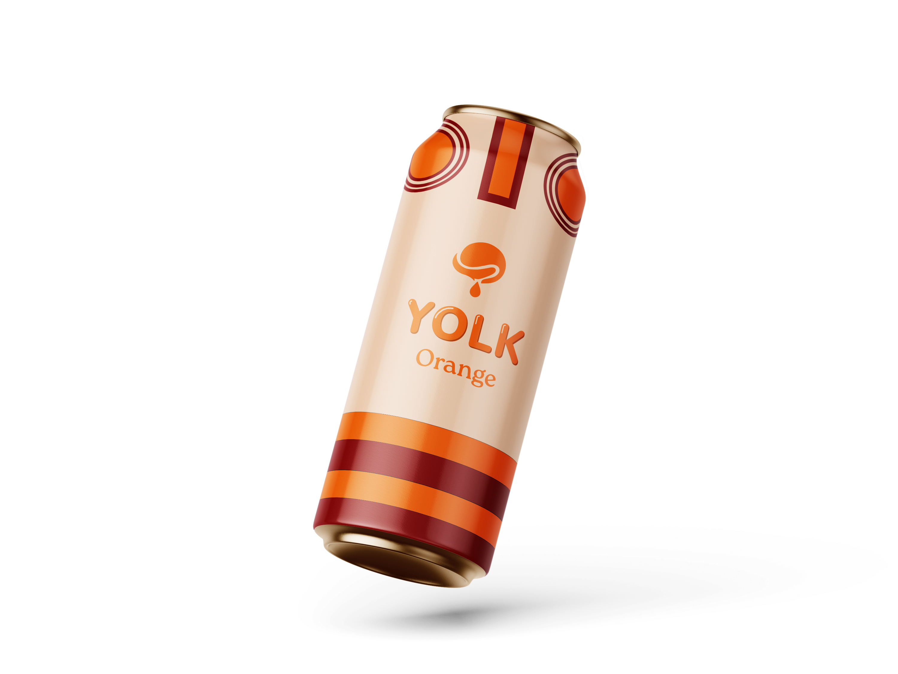
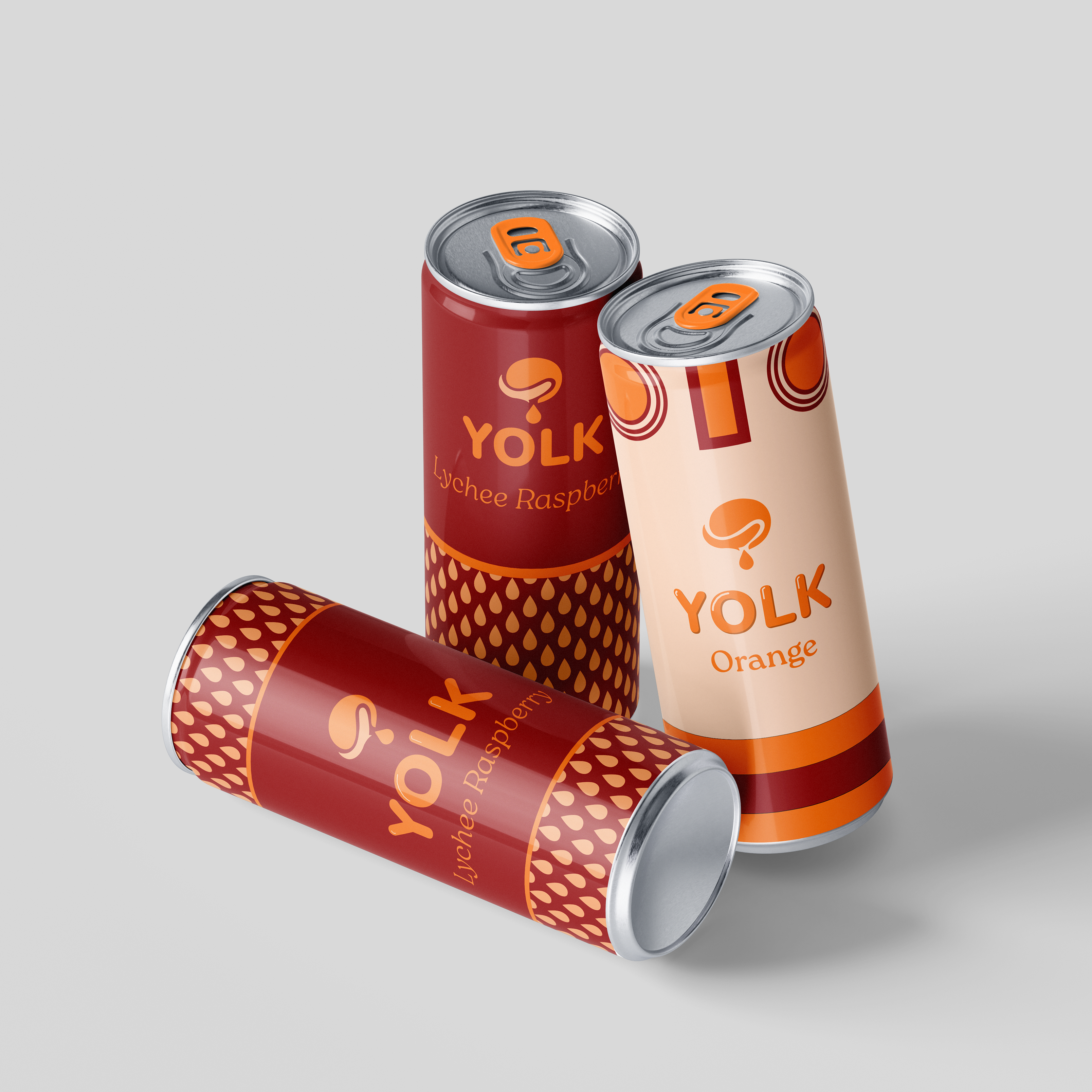
During the ideation phase I ran a naming brainstorm to find a fitting brand name. I chose YOLK, short, recognizable and directly connected to the product without sounding old-fashioned. Based on the HMW questions I then defined what to develop in the prototype phase: a brand guide, logo, can mockup, Instagram feed and campaign video concept.
PHASE 4 — PROTOTYPE
I developed a brand guide for YOLK with a warm yellow-orange color palette and modern typography that fits an energetic festival drink for Gen Z. After testing two different brand directions with the target audience through an A/B test, we combined the strongest elements into one final brand guide. From there I created multiple mockups to bring the brand to life.
BRAND GUIDE
The final brand guide contains all visual guidelines for YOLK, including colors, typography, logo usage and design principles.
To bring the YOLK brand to life, I created a short campaign animation that captures the energy and atmosphere of the festival experience.
BRAND GUIDE STUDY PROJECT
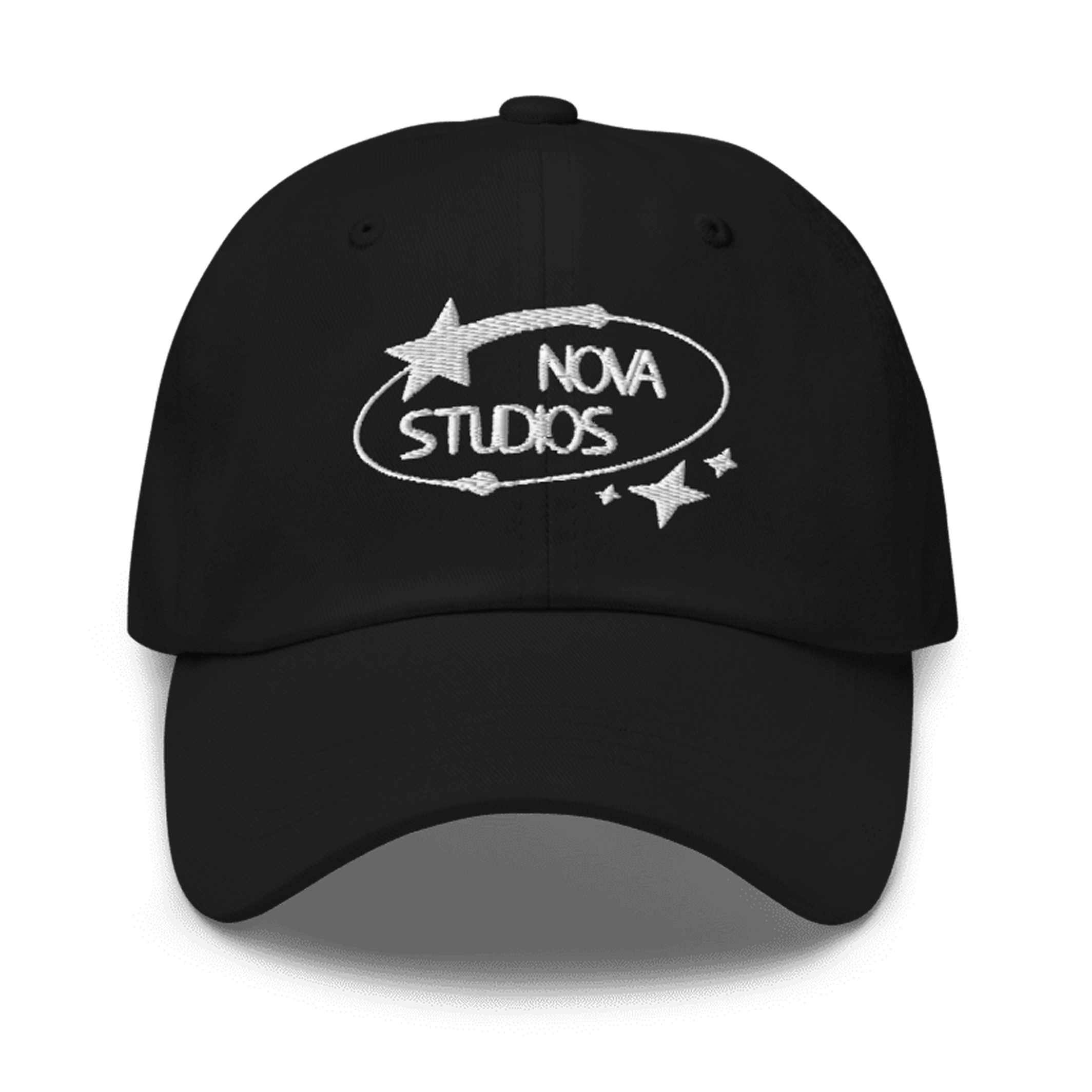
NOVA STUDIOS
Designing a complete brand identity for a fictional media agency — inspired by the energy and power of a supernova.
ROLE
UI/UX Designer
TYPE
Student Project
YEAR
2024
FOCUS
Brand Identity
THE CHALLENGE
The assignment was to design brand-specific elements and a general design language for a media agency. This included coming up with a name, designing a logo, selecting a font and color palette, and creating a complete brand guide, all consistent and thoughtfully considered.
THE NAME
We wanted a name that suits our strengths and sounds modern. After brainstorming, we chose Nova Studios — inspired by the supernova. A supernova is a giant explosion of a star at the end of its life, shining brighter than ever and releasing enormous energy. That powerful energy and sense of transformation became the foundation of our brand identity.
THE LOGO
We agreed early on to keep the logo as simple as possible, while still reflecting the supernova concept. The result is a clean wordmark where the 'O' is transformed into a mini supernova, subtle, but immediately recognizable as a nod to our brand story.
THE BRAND GUIDE
With the name and logo in place, we moved on to the brand guide. We decided as a group to work in black and white, timeless, classic, and strong. Within the brand guide I was responsible for the typography section, defining the fonts and how they should be used across all brand expressions.